If You Can't See It, You Can't Protect It — Building the Argus Security Dashboard
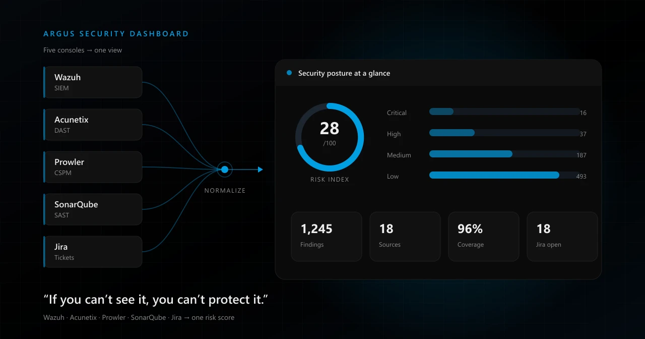
If You Can't See It, You Can't Protect It
Every security programme I have built started from the same uncomfortable admission: we did not actually know what was happening in our own estate.
Not because nobody cared. Because nothing was telling us.
There is a line I keep coming back to, and it has shaped almost every decision I have made since: if you can't see it, you can't protect it. You cannot patch a vulnerability you have not found. You cannot respond to an intrusion nobody logged. You cannot report risk to leadership if the answer to "how are we doing?" is a shrug and a feeling.
This is the story of how we fixed that — in three distinct stages, each one solving the previous stage's problem and creating a new one.
Stage one: the visibility problem
In the beginning we were blind in the most ordinary way. Servers were running, applications were shipping, endpoints were out in the world — and none of it was reporting back to anywhere we could look.
So we did what every team does, and we did it properly. We bought and deployed the tools:
- Wazuh for SIEM — log collection, file integrity monitoring, security configuration assessment, vulnerability detection on hosts
- Zabbix and Uptime Kuma for infrastructure and availability monitoring
- Acunetix for dynamic application security testing against our web applications
- Prowler for cloud security posture across AWS, Azure and Microsoft 365
- SonarQube for static analysis inside the development pipeline
- Jira to track remediation as real, owned, dated work
- Vuls for host vulnerability scanning, with automated report generation
This was genuinely transformative. Microsoft Secure Score went from 40 to 70. Incident response time dropped by 30%. Measured cyber risk came down 40%. We had gone from guessing to knowing.
We had solved the visibility problem.
Stage two: the scattered-data problem
And then a new problem appeared, quietly, the way operational problems usually do.
The data existed. But it lived in eight different places.
To answer one honest question — where is our biggest risk right now? — someone had to log into the Wazuh console, then the Acunetix console, then Prowler, then SonarQube, then Jira. Five logins, five different definitions of "severity", five different exports, and a spreadsheet at the end of it to make any of them comparable.
Worse, the tools disagreed with each other by design:
- One rated a finding Critical, another rated the same class of issue High
- One counted findings per host, another per web target, another per cloud resource
- Nobody normalized status — was that finding closed, suppressed, accepted, or just not seen again?
- The same underlying misconfiguration appeared as three separate findings in three separate products, and nothing linked them
So we had visibility into individual tools, and no visibility into the organization. Leadership did not want eight dashboards. Leadership wanted one number and the story behind it.
We had solved the visibility problem and created a correlation problem.
The Power BI detour
Our first plan was the sensible, boring one: put Power BI on top of it.
On paper it was perfect. Connect to the data sources, model the relationships, publish one report, done. No engineering team required.
The closer we looked, the less it held up — and this is the part I think is worth being honest about, because a lot of teams stop here and never get their dashboard.
The reporting layer was never the hard part. Everything underneath it was:
- API work. Every tool has its own API, its own auth model, its own pagination scheme, its own rate limits. Wazuh, Acunetix, Prowler and Jira share nothing.
- Normalization. Before anything can be compared it needs one schema — one severity scale, one status vocabulary, one asset identity. That is a data-modelling problem, not a visualization problem.
- Deduplication. Without stable fingerprinting, the same finding re-imports as a new finding on every sync and your trend lines become fiction.
- Caching and scheduling. You cannot hit production scanners on every dashboard load. That means scheduled syncs, incremental pulls, a datastore of your own, and a strategy for when a source is down.
- Secrets. Every connector needs credentials. Those credentials need to be encrypted at rest, rotatable, and never sitting in a report definition.
- Access control. Aggregated security findings are one of the most sensitive datasets an organization holds. It needs SSO, roles, and an audit trail — not a shared report link.
Power BI would have rendered the last 10% beautifully. The other 90% was a platform we would have to build regardless. And if we were building the platform anyway, forcing the presentation layer into a BI tool only added a boundary we would spend the next two years fighting.
So we changed the plan: build the whole thing.
Stage three: building Argus
The honest reason this became possible is AI-assisted development. A security team is not a product team. We do not have six engineers to spare for eighteen months. With AI in the loop — governed properly, which I will come back to — a small team could build and ship a real internal platform.
We called it the Argus Security Dashboard. Argus, the hundred-eyed watchman: a lot of eyes, one head making sense of what they see. That is exactly the job.
What it actually is
An API-first aggregation platform rather than a reporting skin:
| Layer | Choice |
|---|---|
| Backend | Django 5 + Django REST Framework |
| Frontend | React 18 + Vite + TypeScript, ECharts for visualization |
| Database | PostgreSQL 16 |
| Async | Celery + Redis, with cron-style schedules per connector |
| Auth | Microsoft Entra ID via SAML 2.0, plus local session login |
| Secrets | Fernet-encrypted connector credentials in the database |
| Deployment | Docker Compose, gunicorn behind nginx |
Each integration is a connector with its own schedule and its own run history — every sync records status, metrics and errors, so "the dashboard looks wrong" becomes a question you can answer instead of a mystery.
Everything the connectors pull is flattened into a small, deliberately boring domain model: a Finding with one severity scale, one status vocabulary and a unique fingerprint; an Asset with a stable identity so findings from different tools can point at the same thing; a Ticket mirroring Jira so detection and remediation live in one view. Plus an audit event trail, because a platform holding this data has to be able to say who looked at what.
What changed in practice
The functional difference is not "we have a dashboard now". It is what the dashboard makes possible:
One posture view. Total findings, critical and high count, connector coverage, open remediation tickets — on one screen, refreshed on a schedule, without anyone logging into a scanner.
Correlation instead of counting. Because findings are normalized against shared assets, the same root cause showing up in three products collapses into one story. An exposed service flagged by the cloud posture scanner, the web scanner and the SIEM is one problem, not three.
An organization-wide risk score. A single index, weighted by severity, source and asset exposure. Not because a number captures nuance — it does not — but because a number can be tracked over time, reported to leadership, and argued about productively. "We are at 28 and trending down" is a conversation. Five spreadsheets is not.
Executive and GRC reporting as a first-class feature. Reports come out of the same normalized data the operational views use, which means the board deck and the analyst's screen can no longer quietly disagree.
Trend, not just state. Once findings are deduplicated and stored, "alert volume down 18% over seven days" becomes a measured fact rather than an impression.
What I would tell another security team
Buying tools solves visibility. It does not solve understanding. Budget for the layer above your tools from the start, or you will spend the next two years doing it by hand in spreadsheets and calling it reporting.
Normalization is the actual product. Severity scales, asset identity, status vocabulary, deduplication fingerprints. Get that right and any visualization works. Get it wrong and no visualization saves you.
Be suspicious of the shortcut that skips the plumbing. BI tools are excellent at the last mile. They do not build your connectors, model your domain, dedupe your findings or hold your secrets. If you are going to build all of that, own the whole stack.
Treat the aggregator as a high-value target. It concentrates every weakness in the estate into one database. SSO, role separation, encrypted credentials and an audit trail are not features to add later — they are the reason it is allowed to exist.
AI changes what a small team can build — if it is governed. Every project we build this way carries a canonical context set: an instructions file defining the domain model and security constraints, org-wide coding standards, and a decisions log. No code is written until that context has been read, security is stated as the primary design constraint, and nothing reaches a protected branch without human review. Speed on the writing. Never on the deciding.
We started unable to see our own estate. Then we could see it, in eight different windows, in eight different dialects. Now there is one window, one dialect, and one number that means something.
Because you cannot protect what you cannot see — and you cannot really see it until it is all in one place.
The dashboard
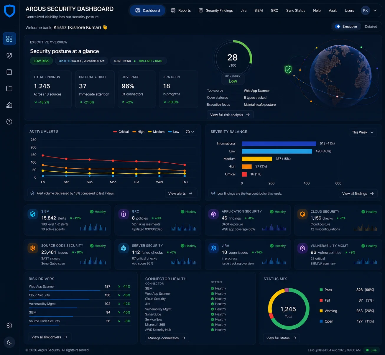
Sample dashboard — the Argus executive overview, shown with illustrative data rather than live production figures. One screen: risk index, severity balance, alert trend, per-connector health and the top risk drivers.